Pelican Cove
This was a project for a small lakeside bar located in Minnesota. They had no prior branding, so I designed this logo in a fashion that reflected the mood they try to invoke in their establishment. Their sensibilities are lighthearted and playful, so I tried to represent that in the seagull.

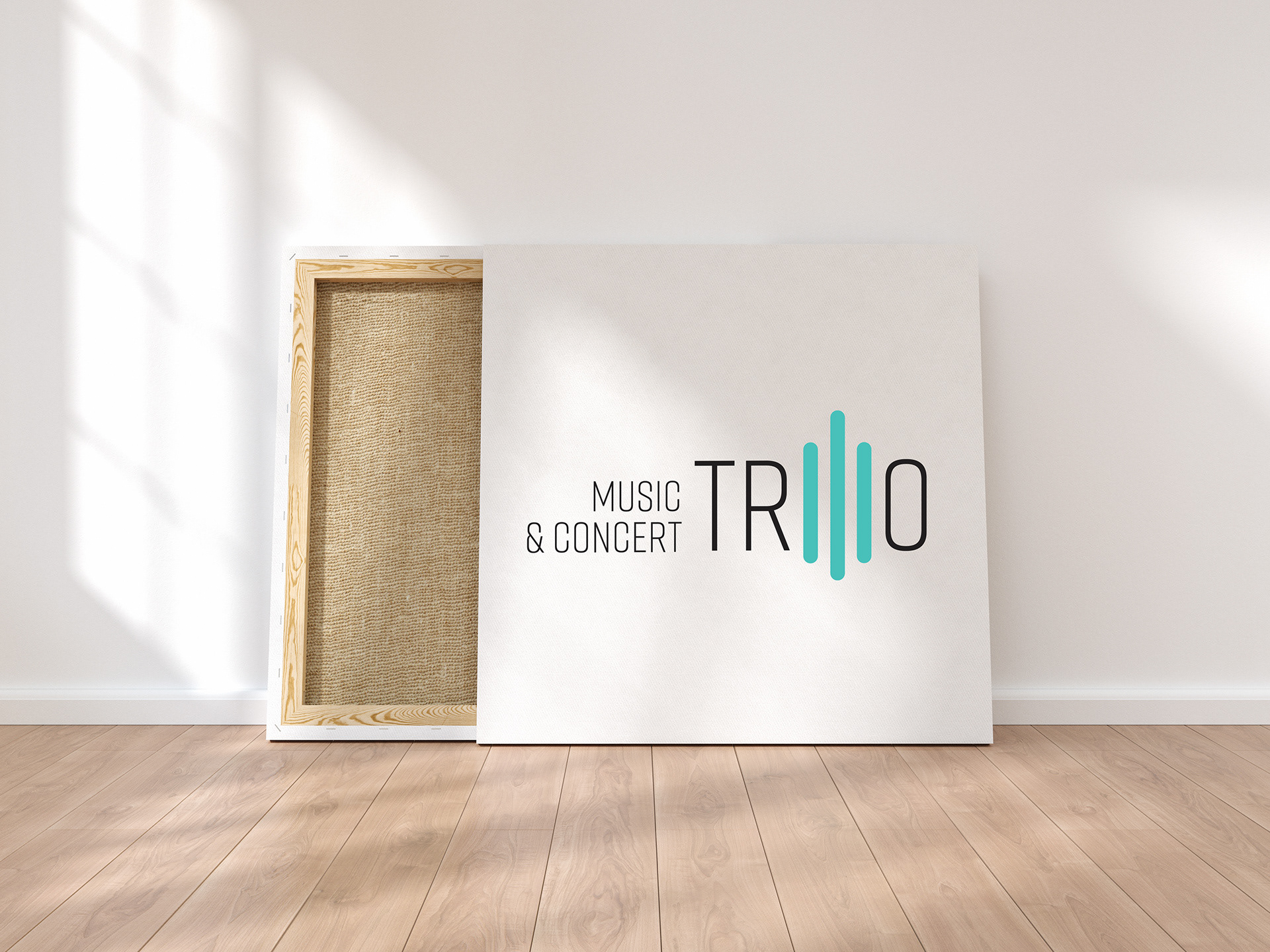
TRIO
Trio is a logo for a concert hall in a fictional Brazilian music themed hotel. All other names in the hotel were based around music. This was the branding for the concert hall within the hotel itself.
Heartland Programs Logos
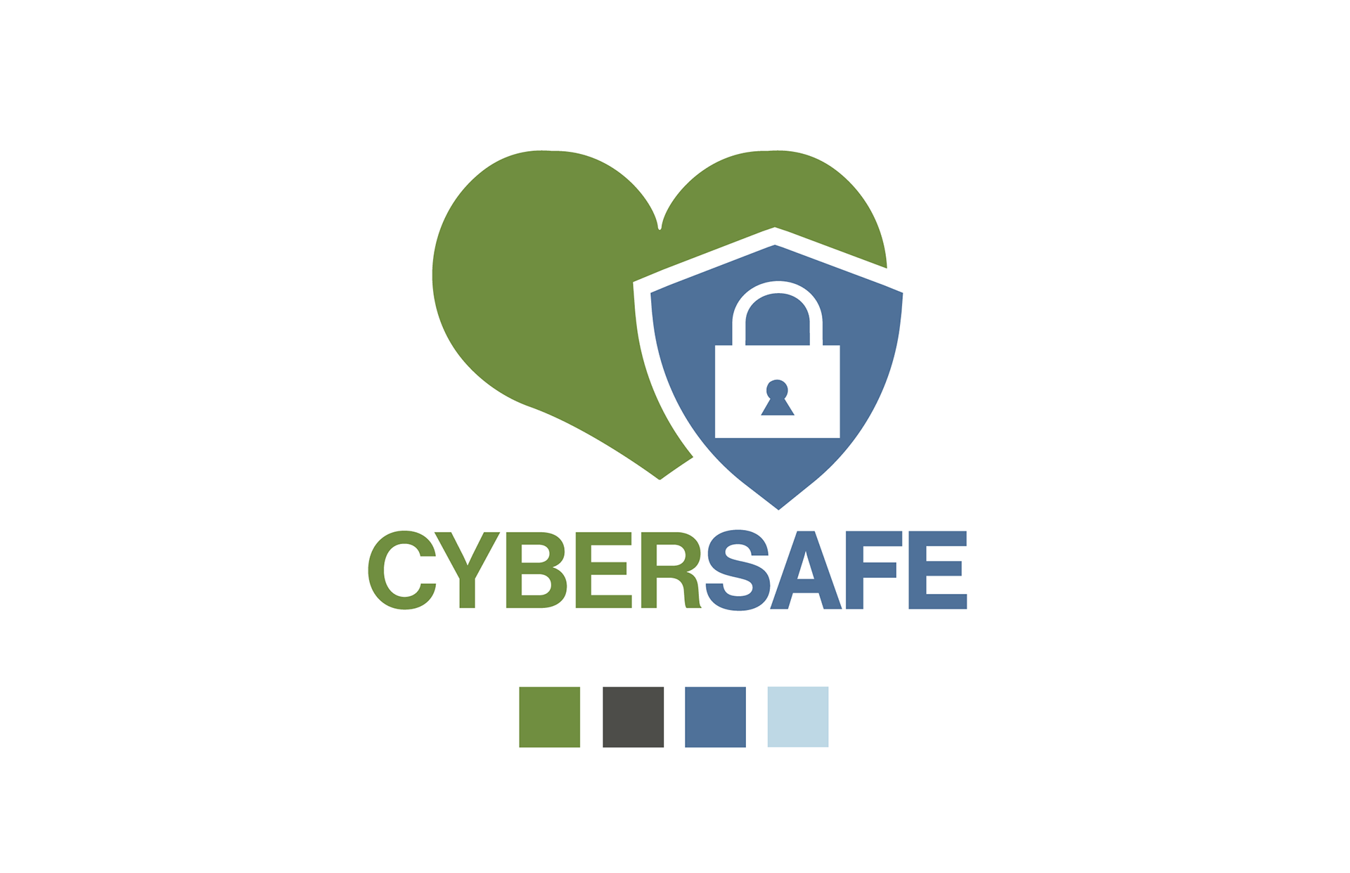
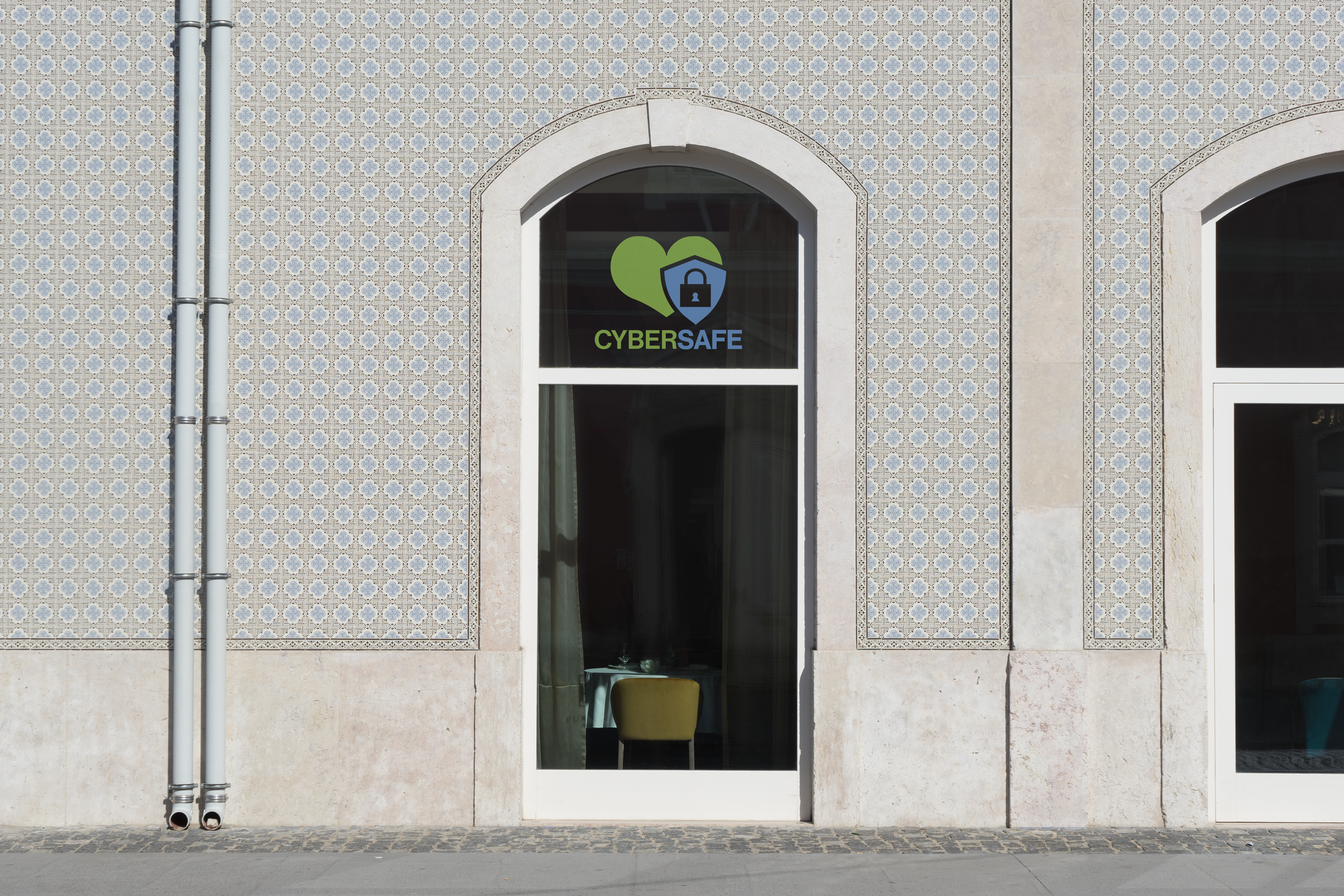
CyberSafe
CyberSafe is Heartland's Cybersecurity program. Previously, no branding existed for this program, and heartland was unsure how to represent that the program was both part of their suite of programs and intended for cybersecurity specifically rather than funds for power. Heartland's original branding implements a heart with the specific green pantone seen here.
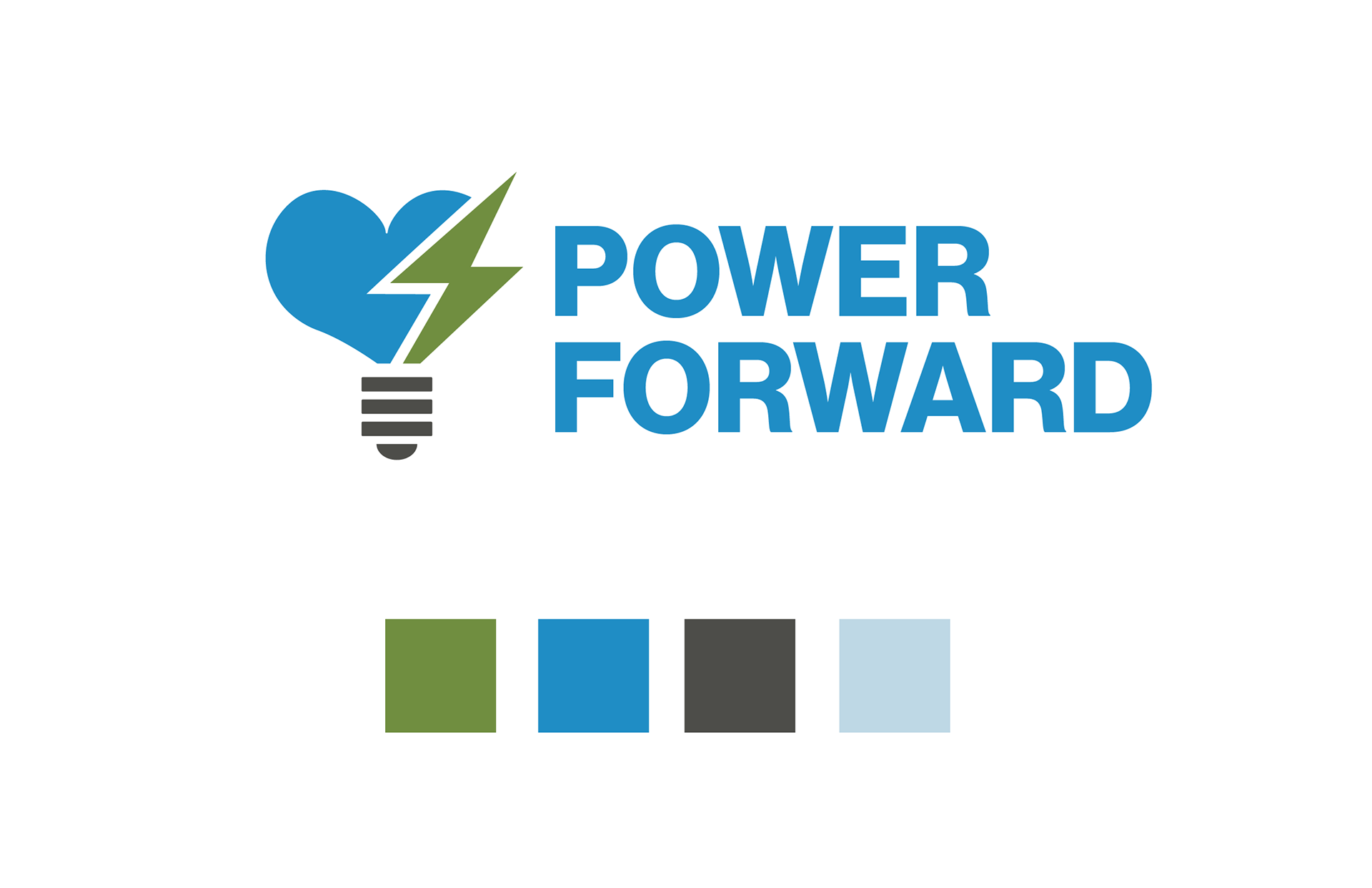
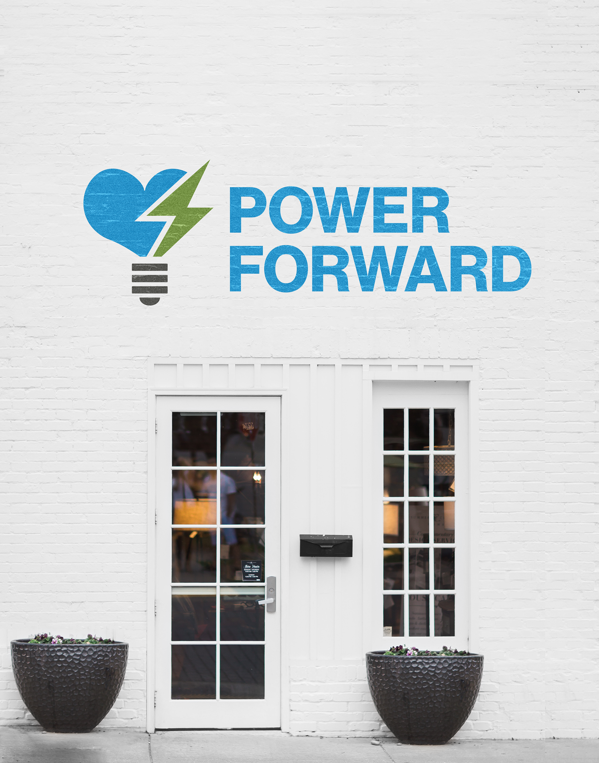
Power Forward
Power Forward is Heartland's energy efficiency incentive program. Their previous logo was largely unused and outdated, and they were looking for something fresh and "modern" to go along with their new suite of program logos. I presented them with this logo, which was representative of their brand but showed this program's emphasis on energy efficiency specifically.
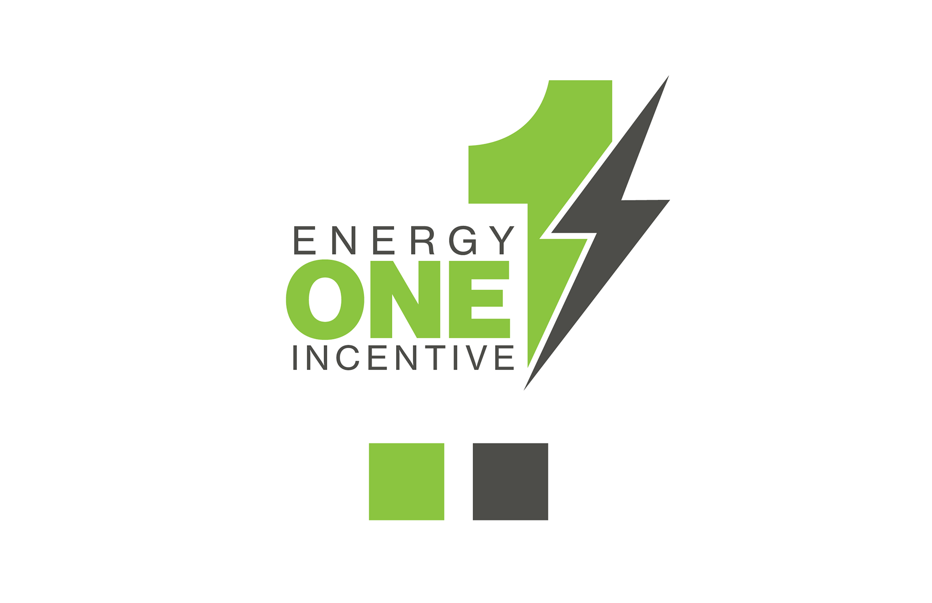
Energy One Incentive
The energy one incentive program logo is unique from the others in that Heartland specifically wished that this logo stay mostly the same with adjustments to freshen it up. They wanted the large "1" to still be prominent over everything else. I had to somehow bridge the connection between the previous logo and the new icon suite. For this logo only, a new green was picked out to give it a more "energized" feeling that would catch eyes. The very dark gray pantone is there to pull back the brightness of the green and balance out the colors.