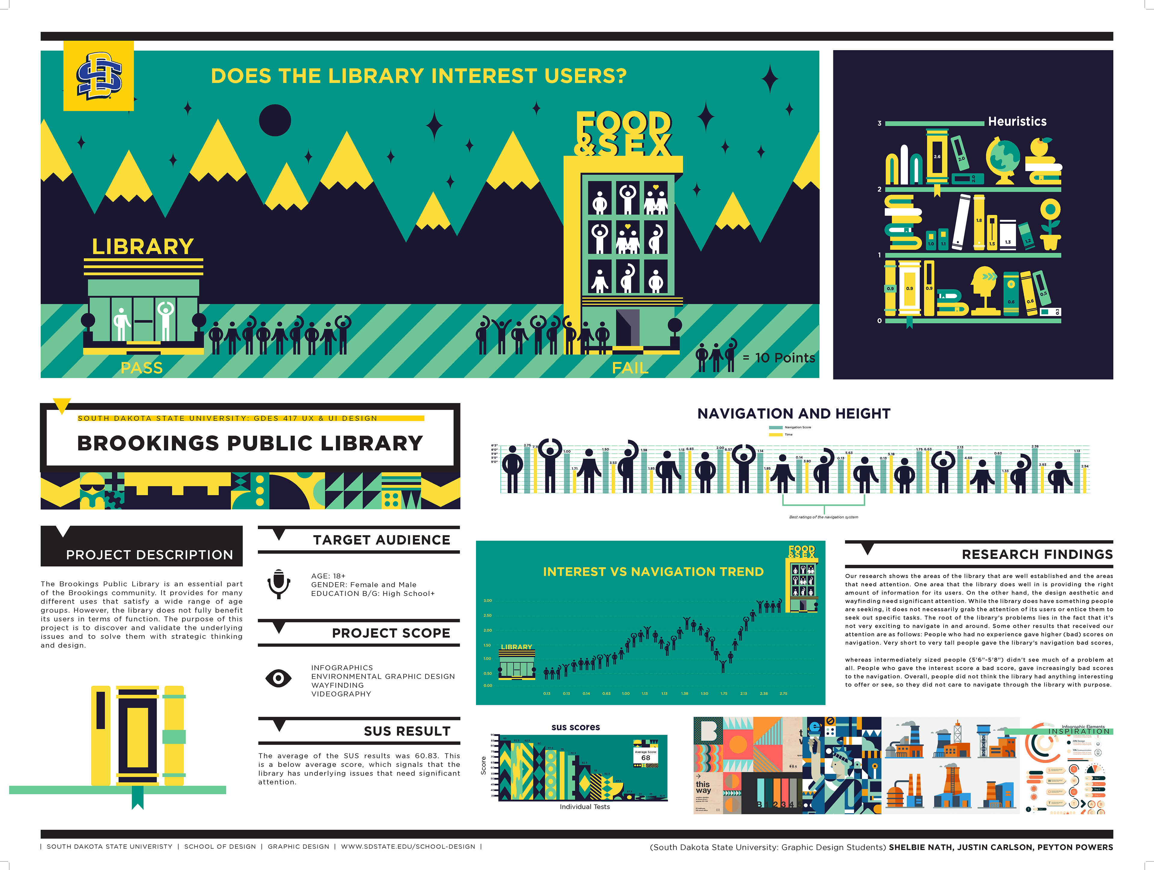
These are infographics generated by me as part of a larger group project to research and redesign the UX/UI of the Brookings Public Library. We evaluated the navigation performance of people within our primary and secondary target audiences, found where their frustrations lie, and how useful they viewed the public library to be. Ultimately, our conclusion was that, regardless of any physical demographics/factors, users who didn't find the library interesting didn't care to navigate it when confronted with the slightest inconvenience or confusion.